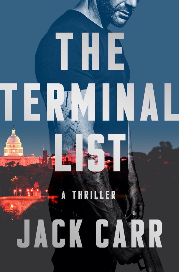
Evolution of a book cover
DON’T JUDGE A BOOK BY ITS COVER. I’M NEW TO THIS, BUT I’M FAIRLY CONFIDENT WHOEVER SAID THAT WASN’T ON A PUBLISHER’S MARKETING TEAM…
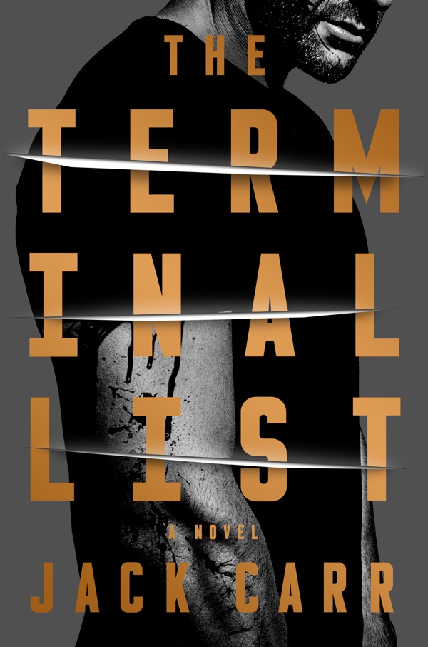
Buyers absolutely judge, and buy, books by their cover, which is why this was such an important decision. The talented art department at Emily Bestler Books/Atria sent me an initial concept of the cover, and I’ll have to admit, it was really cool to see the words “The Terminal List” on the mock-up jacket.
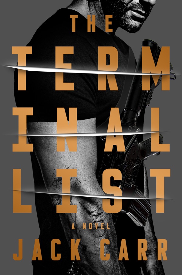
Everyone loved the image: it was dark, sinister and dramatic and very much captured the theme of the book. The slashes on the page almost looked three-dimensional, the cover really stood out. Someone raised a good point though, Jack Carr is an unknown author, does this cover signal to the potential reader that this is a military/political thriller? Despite being splattered with blood, was the figure on the cover too “50 Shades”? What if we slung a weapon on him? Surely the image of an M4 would let everyone know that this was no romance novel.
Photoshop is amazing but apparently not infallible; it was fairly obvious, even to my eye, that the weapon had been added in post-processing. Clearly, the photo would have to be re-shot. I was worried, though. Would they get the details of the weapon correct? The sling, the ATPIAL laser, the Surefire Scout light, the optic. . . Where does one even find an M4 in New York City? I could smell the disaster. Nope, this wasn’t going to work. There was another issue, splitting “Terminal” into three lines grabbed your attention, but would it turn some people off? I showed it to a dozen or so friends and family and the verdict was split. Interestingly, people either loved it or hated it, almost no one was indifferent. On to the next iteration to see what it would look like with the words spelled-out normally?
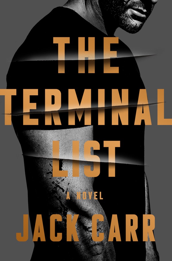
There was universal agreement that spelling-out the title was the way to go, but we still hadn’t solved the genre identification problem. It was time to abandon the original “slasher” cover and go with something that really signaled “political-military thriller.”
Nothing indicates politics like the Washington, D.C. skyline, and adding the line “A Thriller” left no mistake as to the genre. We were getting very close but, as we learn in the military, attention to detail is everything. The skyline looked a bit out of line, visually, so we asked them to move the Capitol dome closer to the center.
We also went back to the weapon concept and, as you can see, the figure on the cover was holding a Sig Sauer P226 9mm handgun, the standard issue sidearm for the SEAL Teams. The bad news? James Reece, the hero of The Terminal List, carries a Glock 19, not a Sig. Easy fix they said. But wait, his finger is on the trigger—a huge “no go”.
This is it, the final version. I think that it really captures the essential elements of the book: abuse of power and unrestrained vengeance. The shining D.C. skyline is juxtaposed with a bloodied figure who has killed and is poised to kill again. And if you notice, his trigger finger is right where it is supposed to be. Authenticity to the end.
I’d like to personally thank Albert Tang, the talented art director and everyone else at Emily Bestler Books/Atria who was so patient during this process!
